Camp Network
Designing its first native ecosystem hub to incentivize testnet transactions within their community 🏕️

Problem
Prior to me joining the team, Camp Network had not created any community facing UI, nor established its camp-themed assets.
“Camp Network’s mission is to create a seamless, camp-themed ecosystem hub that incentivizes users for its testnet while fostering more community engagement”
James Chi, Founder and CEO
My Role
Created wireframes & prototypes.
Conducted research on building up the camp theme.
Mapped existing and ideal workflow.
Designed the user interface.
Reviewed design development with developers.
Objectives
Incentivize Testnet Actions:
Create the first interactive Camp website for its testnet program so community members can interact with the protocol
Camp Themed:
Design the entire interface with a camp-theme to align with its ethos of camp and community building
Seamless Interface:
The UI across blockchain has made it difficult for users to join. Camp’s ecosystem hub must be seamless to use and navigate through
Design Process
How do we solve for the needs of both Camp Network protocol and its community of users?
3-Step Solution
1
Moodboarding
Create a moodboard of camp-branded assets that we could apply for the entire interface
2
Research Analysis
Analysis on which design style would best align with its target audience and accomplish their goals around simplicity, fun, interactive and camp-themed
3
Intuitive Interface
Create a fully functional, user-facing interface that clearly directed users towards completing tasks on Camp’s testnet
1
Moodboarding
Focus on a color palette that communicates a bold, camping-like theme
0 1
Colors
#ff9160
#111111
#f4f4f8
System
Text & Background
Colors that represent brand, used as primary color and accents.
Designed to clearly communicate actions, status, and direction within the interface.
Grayscales that made up the background and text color.
#ff6d01
#f1ce5f
#daaf50
2
Research Analysis
Focus on X color and Y theme to communicate a bold, camping-like theme
Icons
0 2


These icons were created to further go along with the overall cozy camp theme. The icons included the four elements to making a fire along with icons for the coinflip game.
3
Intuitive Interface
Create a fully functional, user-facing interface that clearly directed users towards completing tasks on Camp’s testnet
Step 1: Create a centralized hub

Step 2: Design an interface where users can interact with its four testnet actions, resembling the creation of a fire with its 4 elements (oxygen, heat, fuel, wood)
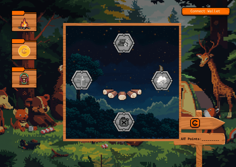
Step 3: Created a brand new “coin flip” game where users can use testnet tokens to interact with Camp’s testnet in a gamified, engaging UI

RESULTS
200k Transactions in 1 Day
Outperformed initial expectations, with other 200,000+ transactions on the Camp Network testnet within 24 hours of launch
1
75k Users in 1 Day
Outperformed initial expectations, with other 75,000+ users actively interacting with the Camp Network testnet within 24 hours of launch
2
Increased Awareness
This successful testnet ecosystem hub generated tons of marketing virality and help onboarded 15 new influencers into their marketing program
3
RESULT TAKEAWAY
Camp’s ecosystem hub drove significant traffic to the Camp testnet program, outperforming expectations on both user adoption and testnet transactions, while positioning Camp as a brand that understands its user audience and knows how to reinforce its branding in an engaging way